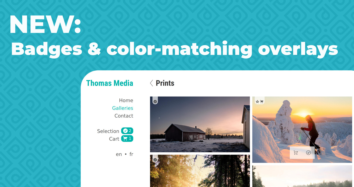
New image badges + color-matching overlays
Today’s product update focuses on the texts and buttons that are displayed on the thumbnails and images/videos on PhotoDeck-powered websites.
NEW: “selected” and “in cart” badges
When a visitor on your website adds an image or video to their lightbox/selection, a badge now appears on the selected file. This makes it for example very easy to see at once what images in a gallery are already selected.
Similarly, a cart badge appears for each image or video that has been added to the cart (and the same cart icon is now used on pricing buttons in place of the currency symbol, a change that will please many members).
 In addition, the same lightbox/cart icons are added in a prominent way to the links in your menu, so it’s easier for clients to notice them and navigate the site. And as a nice usability improvement, one can now un-select an image/video directly from its thumbnail in the gallery.
The “artist’s pick” recommendation star is now also integrated with these new badges. (As a reminder, that star appears on images that you have rated 5-star in eg. Lightroom before upload, or in your admin space).
Updated themes for more flexible, color-matched overlays on image and videos
The new badges are displayed like everything else overlaid on top of the images: on a semi-transparent background.
These overlays have been slightly adjusted (blurred background) to further improve their legibility, and if your buttons have rounded corners, the overlay buttons now match them.
In addition, the themes have been updated: the overlays now use by default the same colors as the website’s main background and text (defined under Main colors in the theme customization), so the result is visually better integrated and cleaner.
And importantly, the update also brings you the ability to customize the color of both the overlay background and the text/icons on them for ultimate design flexibility. For example, you can change the overlays to match the website’s accent or buttons’ colors.

More integrated full-screen background
With the updated themes, the full-screen view now also takes by default the same background color as the overlays for consistency, and that too is customizable on the updated themes if you prefer another color.
(If you don’t see the fullscreen option on your website but would like to enable it, open the gallery display styles you are using and you’ll find the option under Enlarged images and videos / Navigation and buttons / Buttons to display.)
Some of these improvements will appear automatically when you make global changes to your website.
But to benefit from all what this upgrade has to offer, please accept the prompt to upgrade your themes (mobile and desktop) in your dashboard.